
Korean Calligraphy (Seoye): The Art of Writing Hangul

Eastern calligraphy has been around since the Tang Dynasty (618~907), and flourished most famously by calligrapher and politician, Wang Xizhi (303 AD–361 AD). With ink stone where the ink is poured and ink is stirred with ink, stick calligraphy is written with brushes. Calligraphy was a writing process of Chinese characters, but for a long time it has always been a ritual of “training and disciplining the mind” often practiced by the noble class aristocrats, the royals, or the intellectuals. Despite the fall of traditional style of calligraphy today, the art of writing characters still lives today in a more contemporary form of fonts.
The Beginning of Writing Hangul
The beginning calligraphy of the Korean language, hangul (한글) has only been around for 500 years since the birth of the language in 1443. The Hunmin-jeongum (훈민정음), documents written by the creator of the Korean language, King Sejong (1397-1450), describe the proper way to pronounce and script each Korean characters. The font style of calligraphy used in this document is called panbonche (판본체), which is considered the most traditional or standard style. The document is also in the style of honseoche (혼서체), meaning that it is written in combination of both Chinese calligraphy and hangul calligraphy. It wasn’t until later that hangul calligraphy was used solely on its own, largely because hangul was considered humble and was looked down on. However, in the 16th to 17th Century, during the Joseon Dynasty (1392-1910), it was used within the palace by the lady secretary officer of the royal court for writing the king's orders or queen’s letters to her family. This Korean calligraphy they used at the palace developed into a specific font that is more beautiful and convenient to write. It was called Gungche (궁체), literally the Palace Style.
Seoye as an Art Form
The time when calligraphy truly started to blossom as a culture was during the Japanese occupation of Korea in 1910. Hangul calligraphy called seoye (서예) received its name as it became more of an artistic process rather than merely writing of characters. The “ye (예)” part of the word is the same character used in the word for arts, yesul (예술). The “ye” part directly relates to seoye’s artistic characteristics. Seoye starts to have vernacular of its own as a form of art. Especially as various fonts of seoye developed during the Japanese occupation (1910-1945) and on, there was particular beauty and representations in not just the written results of hangul calligraphy, but also in the ritual of how it was written. During the Japanese occupation, calligraphy served as a perfect expression of protest against the Japanese government.
Aesthetically, the standard panbonchae or goche (고체), literally meaning “old style,” was a style where each of the characters are almost placed in a perfectly square grid. The dots and lines are firm and straight with no marks of hesitation or thickening of the ends. The main emphasis seems to have been on the overall balance of a character placed within each grid.

Panbonche or goche (old style) font / Image Courtesy dramasROK
For famous calligraphers, such as Kim Choonghyun (1921-2006), his own style emerged from the traditional goche font. His goche font had similar balance of the characters but the lines are more wobbly and there is more emphasis on where the stroke finishes. The thickness is also inconsistent. All of these contribute to making the characters appear more dynamic and light.

Kim Choonghyun’s goche (old style) font / Image Courtesy dramasROK
As briefly mentioned before, gungche was developed when hangul was first used by the palace court ladies because aristocrats or elite men were not willing to adapt a new language. Hangul was considered women’s letters and the font used was much more flowy and elegant. The places in each character's control, where to put strength and where to let go of it, are reflected much more distinctively in the palace style.

Gungche font / Image Courtesy dramasROK
The most well known calligrapher for gungche calligraphy was Lee Chulkyung (1914-1989). She continued to stand her ground by writing hangul and was selected to exhibit at Choseon Seodo (Seoye) Exhibition even during a time where the entire country was governed by Japanese, including arts exhibitions and organizations. She continued to put all her effort to flourish hangul and gungche fonts and wrote “How to Write in Gungche,'' but the document was prohibited within only five days of being published. For promoting the Korean language and font, she was prosecuted by the police.
Cursive style, also called heulimche (흘림체), was also in fashion during this time. With more dragging of the brush across each character of this style, it became easier for the calligrapher to write faster. Aesthetically, the font appears to express his or her emotions more freely.

Cursive Gungche font / Image Courtesy dramasROK
What makes seoye beautiful is the neatly aligned characters, each of them well balanced, as well as the aesthetics of in-between spaces, which gives a pause to the story of the language.
The Message: Interpreting Beyond the Strokes
Seoye comes to life when the message is interpreted beyond what is reflected on paper. The unshaken strokes, the perfectly shaped circles connected by dragging of the brush in the case of the cursive style, is as if to reflect the upright characteristics, determined mindset of a calligrapher and feels even peaceful at heart. Being able to see a calligrapher's state of mind by reading in between the lines, the dots, the shapes, and its thickness or sizes only then unwinds the rest of the message to be read with sincerity, respect, and with truth.
Because the writer's heart and mind was reflected through each stroke, it was a practice to train the mind and body. It was a repetitive ritual through which they aimed to clear their thoughts by losing themselves only in one goal–-to write well–and almost become one with the path the language travels. As the mind is purified, so is their heart. They repeat the ritual seeking to achieve total emptiness of their mind and heart, completely letting go of all matters worldly, as in the philosophy of Buddhism. The calligraphers fill the blank piece of paper with contrasting colored ink to empty out their desires, greed, or material matters that reside deep within their hearts in an effort to find simplicity. This idea which originates from Buddhism is similar to what Korean artists who emerged in the 1960s aimed to do with their Dansaekhwa art. It is natural considering Korea’s long history of Chinese influence and Buddhism as a religion that Korean art or writing reflects heavily on Buddhist practices. Thus, perhaps the most effective way of interpreting Korean calligraphy is to read between the dots and lines, beyond the delicate and elegant aesthetics of the representation of each character and to delve deep in to discover the hidden story that calligrapher is telling or to be more accurate, “showing.”
Seoye Today
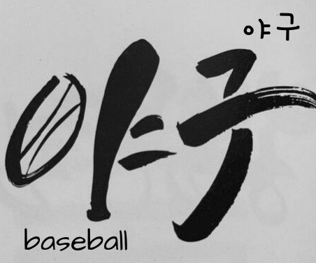
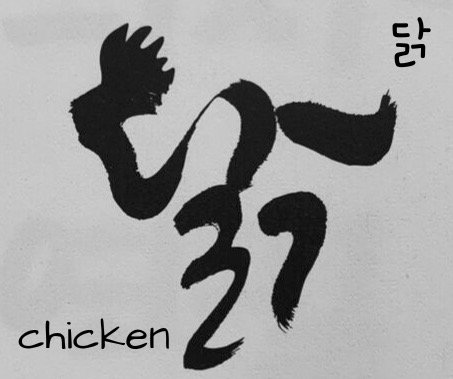
Korean calligraphy today is much more dynamic, fun, and interesting shapes. It has come to serve more as an art form than a tool to convey a message. One example is calligraphy by Ahn Sangsoo (b. 1952), who creates beautiful fonts with hangul incorporating a drawing within the characters.
Calligraphy by Ahn Sangsoo / Image Courtesy dramasROK
It has started to be shaped so that it attracts younger Koreans who may have no interest in traditional seoye. While it is true that most seoye practices are disappearing, there are still some modern calligraphers like Ahn who continue to thrive to keep elongating the lifespan of the fading art. Once people know the beauty, the effort, the heart, the touch, and the history of the calligrapher that lingers within each stroke and each character, they will appreciate the value in seoye whether it is modern or traditional. The cultural legacy will continue to thrive.